Chapter 5 Question 2
Question:
Can the three yield curve factors explain the time-series variation in spot rates? Regress \(y_t(1)\) on a constant and \(X_t\) and comment on the regression statistics. Perform the same analysis for \(y_t(5)\) and \(y_t(10)\).
In this question, data for the \(y_t(1)\), \(y_t(5)\), and \(y_t(10)\) spot rates is required along with the yield curve factors, \(X_t\). These have been calculated in Section 3.1 and Section 3.5, and the results from there are used here.
5.1 Regression
The following regression was run on every spot rate series:
\[ y_{t}(n) = \alpha(n) + \beta_1(n) \text{Level}_t + \beta_2(n) \text{Slope}_t + \beta_3(n) \text{Curvature}_t + \epsilon_t(n) \]
Using the concept of multiple models from the book, R 4 Data Science, implementing these regressions in R is incredibly straightforward. The general concept involves two steps:
- Split the data set of all 14 maturities into 14 groups, stored in a nested data frame.
- For each group, run the linear model above and store the result.
The final result is a compact single data frame that contains the 14 resulting models along with the original data, indexed by the maturity.
## # A tibble: 14 x 3
##    maturity data               model
##       <dbl> <list>             <list>
##  1   0.0833 <tibble [459 × 5]> <S3: lm>
##  2   0.25   <tibble [459 × 5]> <S3: lm>
##  3   0.917  <tibble [459 × 5]> <S3: lm>
##  4   1      <tibble [459 × 5]> <S3: lm>
##  5   2      <tibble [459 × 5]> <S3: lm>
##  6   2.92   <tibble [459 × 5]> <S3: lm>
##  7   3      <tibble [459 × 5]> <S3: lm>
##  8   4.92   <tibble [459 × 5]> <S3: lm>
##  9   5      <tibble [459 × 5]> <S3: lm>
## 10   6.92   <tibble [459 × 5]> <S3: lm>
## 11   7      <tibble [459 × 5]> <S3: lm>
## 12   8      <tibble [459 × 5]> <S3: lm>
## 13   9.92   <tibble [459 × 5]> <S3: lm>
## 14  10      <tibble [459 × 5]> <S3: lm>
5.2 One Year Spot Rate
As seen in Table 5.1 and Table 5.2, all estimates for the 1 year spot rate model are highly significant, and the Adjusted \(R^2\) is nearing 100%, suggesting that the model can explain essentially all of the variation in the spot rate. Considering that the constructed yield curve factors include \(y_t(2)\) as the level effect, this should not be surprising as all of the series are highly correlated. The very high statistic on the level coefficient supports the claim of its importance.
| Term | Estimate | Standard Error | Statistic | P-Value |
|---|---|---|---|---|
| Intercept | 0.001014021 | 0.0001280165 | 7.921022 | 1.8e-14 |
| Level | 0.989941953 | 0.0015226534 | 650.142657 | 0.0e+00 |
| Slope | 0.264774017 | 0.0034323179 | 77.141460 | 0.0e+00 |
| Curvature | -0.428350107 | 0.0057618892 | -74.341954 | 0.0e+00 |
| R Squared | R Squared Adj | Residual Std Error |
|---|---|---|
| 0.9995224 | 0.9995193 | 0.0008223 |
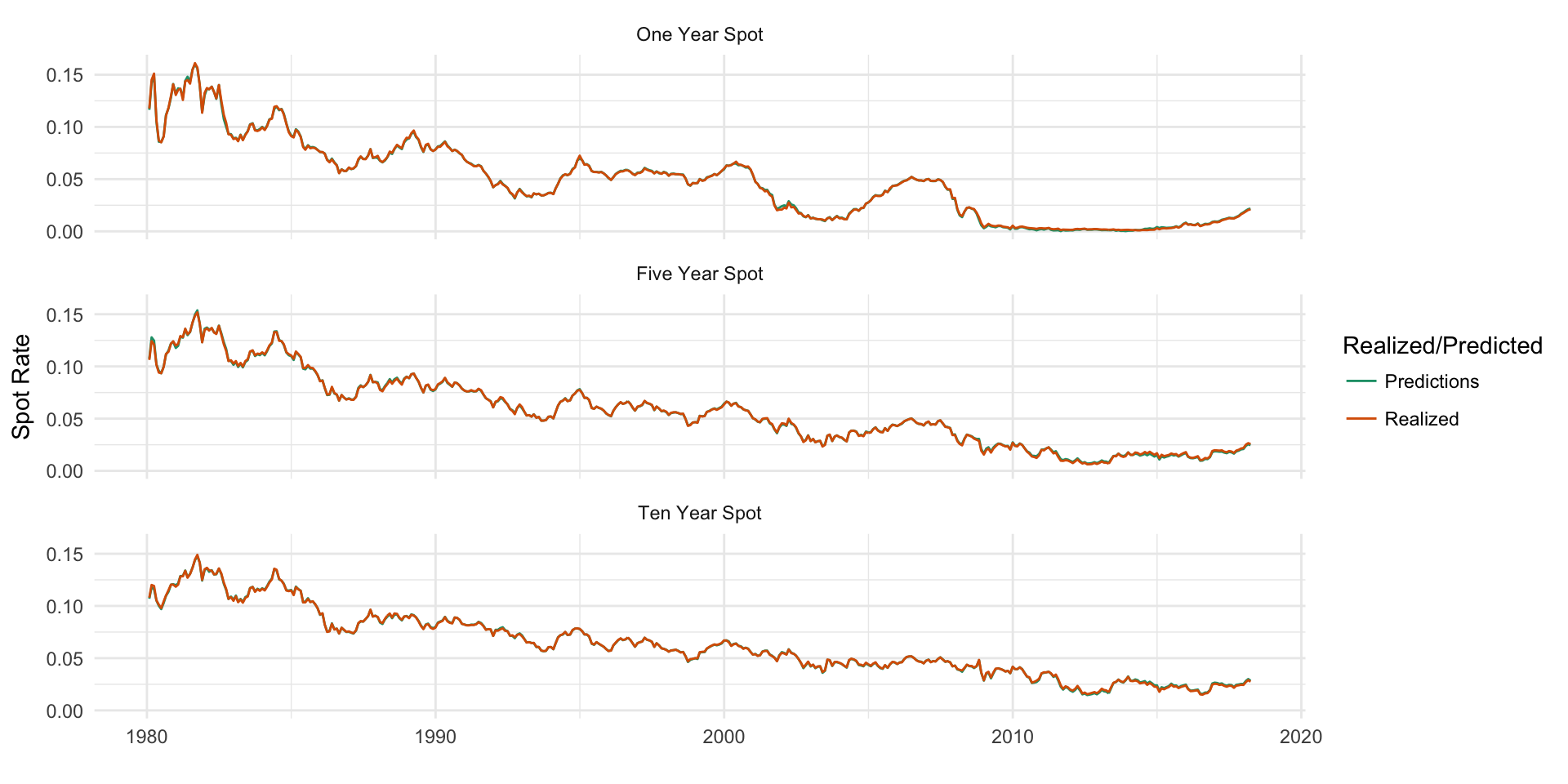
A chart of the realized VS predicted time series for each model confirms how well the variation is explained, with essentailly perfect matching of the realized series. It is important to remember that this model is not predicting out-of-sample future rates, and is simply used to gather intuition about past rates. Nevertheless, it is interesting to see how well the yield curve factors explain the variation.

Figure 5.1: In-sample realized VS predicted spot rate series
5.3 Five Year Spot Rate
The model for the 5-year rate is similar to the 1-year rate in terms of explanatory power. The level coefficient is slightly higher than for the 1-year, and is >1, which makes sense considering that the 5-year is generally higher than the 2-year spot rate used to represent the level effect. The slope is more than triple that of the 1-year, suggesting that an increase in the slope has a larger impact on the value of the 5-year curve than it does on the 1-year.
| Term | Estimate | Standard Error | Statistic | P-Value |
|---|---|---|---|---|
| Intercept | -0.001326488 | 0.0001178948 | -11.25146 | 0 |
| Level | 1.010756975 | 0.0014022642 | 720.80351 | 0 |
| Slope | 0.862622600 | 0.0031609403 | 272.90063 | 0 |
| Curvature | -0.237885069 | 0.0053063231 | -44.83049 | 0 |
| R Squared | R Squared Adj | Residual Std Error |
|---|---|---|
| 0.9995226 | 0.9995194 | 0.0007572 |
5.4 Ten Year Spot Rate
Finally, the 10-year model performs similarly to the 1 and 5-year models. One interesting thing to note about the 10-year model is that the sign on the curvature coefficient is opposite that of the 1 and 5-year models.
| Term | Estimate | Standard Error | Statistic | P-Value |
|---|---|---|---|---|
| Intercept | 0.001285415 | 9.632731e-05 | 13.34424 | 0 |
| Level | 0.990119282 | 1.145736e-03 | 864.17722 | 0 |
| Slope | 1.041806029 | 2.582683e-03 | 403.38126 | 0 |
| Curvature | 0.101703126 | 4.335593e-03 | 23.45772 | 0 |
| R Squared | R Squared Adj | Residual Std Error |
|---|---|---|
| 0.9996166 | 0.9996141 | 0.0006187 |
5.5 Decomposing the Spot Curve
Although not specifically asked for, it might be interesting to decompose and plot the spot curve at a few particular points in time. The procedure for this involves the following manipulations:
- For month
m, extract the spot rate at every available maturity for that month. - For month
m, filter the yield curve factors down to that month, and multiply each maturity’s regression coefficients by the corresponding yield curve factor. This gives the contribution of each factor for that month and each maturity. - Join the two data sets and chart them to view the decomposed spot rate for any month.
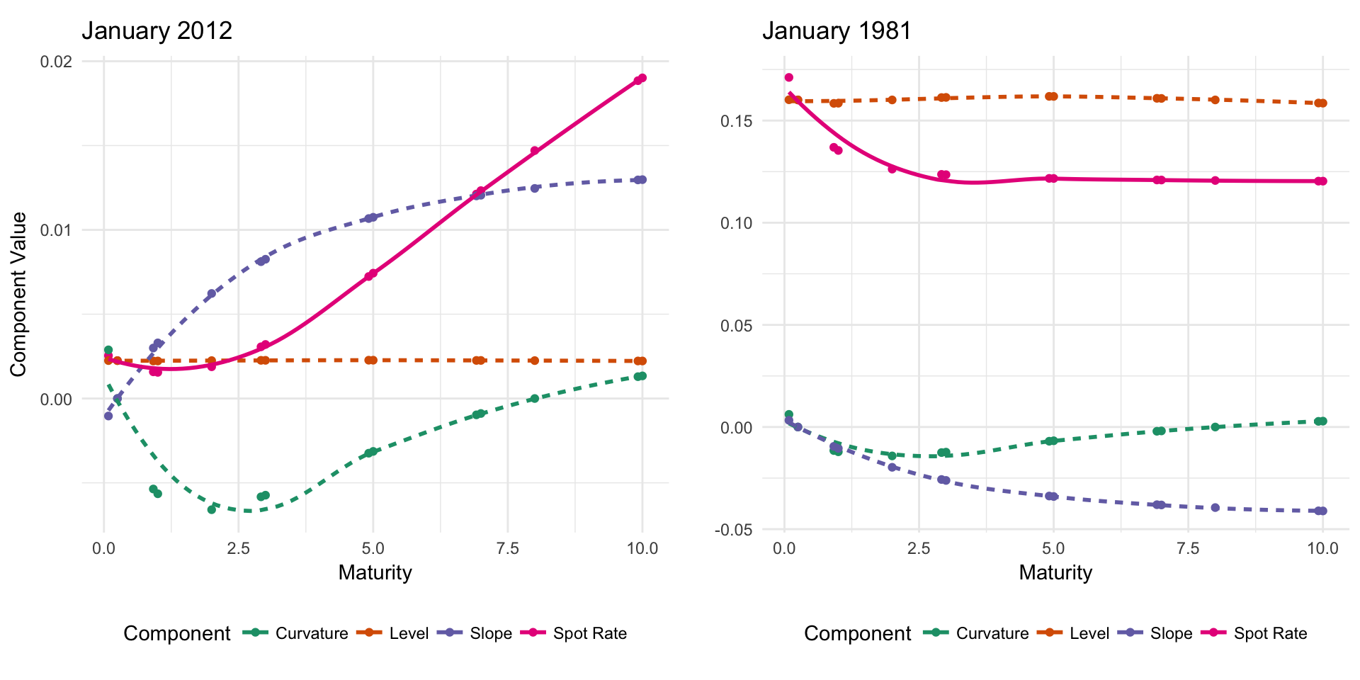
This procedure was streamlined into a single function, parameterized by the month to allow for easy plotting and comparison of multiple months. For example, the decomposed spot curve for January 2012 and January 1981 are shown side-by-side in Figure 5.2. January of 1981 was definitely an interesting time period! The spot rate is essentially inverted, with lower maturity bonds having higher spot rates than longer maturity bonds.

Figure 5.2: Decomposed spot rate for January of 2012 and 1981
5.6 Coefficient Stability
Another question worth asking is how stable the coefficients are throughout time. We can test this by running the same regression as before, but with a rolling window. This works
by calculating the regression spot_rate ~ level + slope + curvature for the
first 100 months, then shifting forward 1 month and dropping the last day, calculating the
regression again, and repeating this for the length of the series. The rsample
package provides a number of helpers for doing analysis exactly like this. The procedure for this is:
- Split the data into 14 nested groups by maturity, as done in Section 5.1.
- Further split each of the 14 groups into 359 rolling subsets of 100 days each using
rolling_origin()fromrsample. - For each maturity, and for each rolling split, run the regression from 5.1. This results in 5026 regressions, which, on this 4-core computer, can be run in parallel in ~8 seconds.
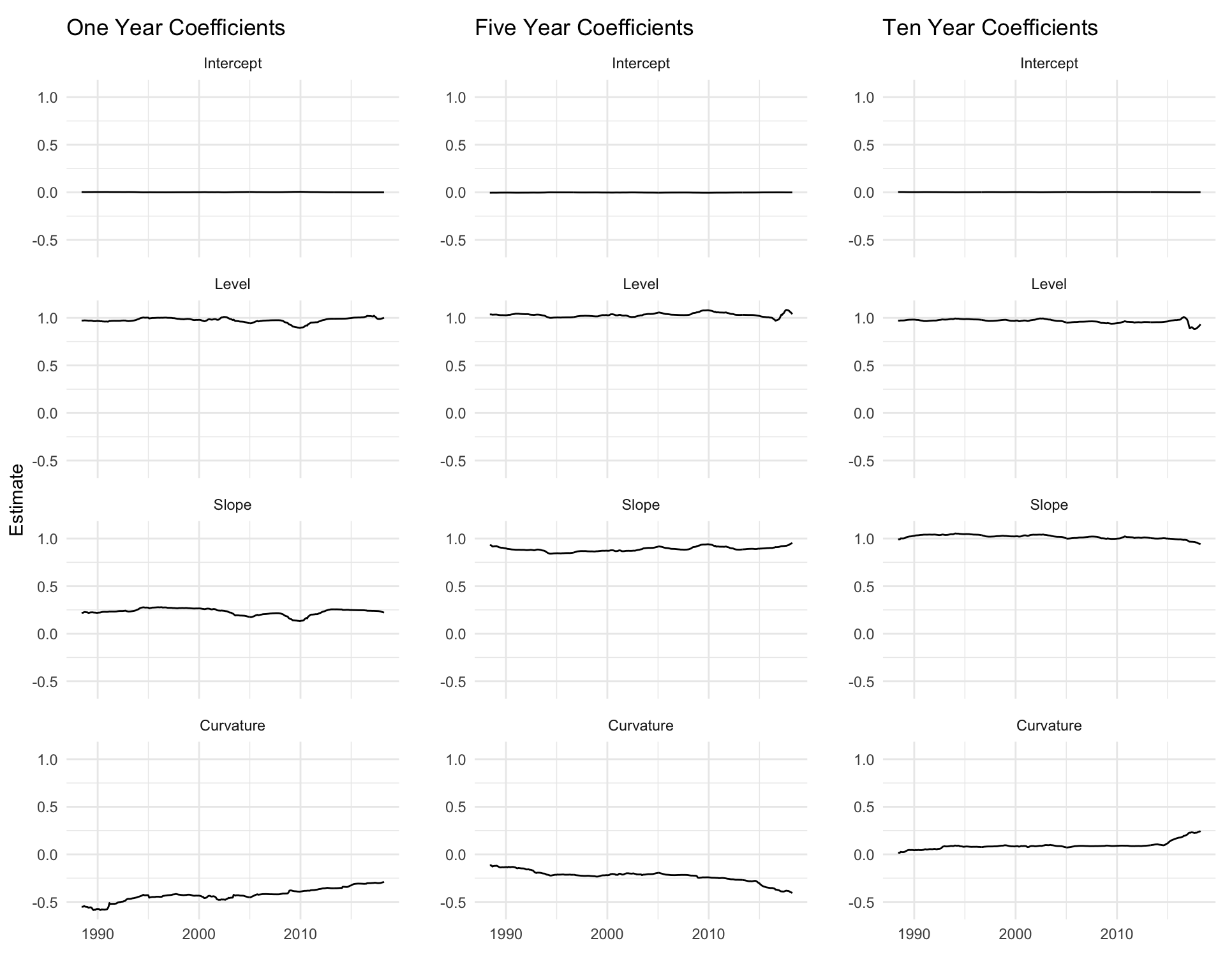
When the procedure has been run, a natural next step is to pick some of the 14 maturities and look at the stability of each coefficient over time. For example, the 1, 5, and 10 year coefficients over time are shown side-by-side in Figure 5.3. Most of the coefficients are fairly stable over time, with the exception of curvature. The curvature of the 1 year has begun to rise up from -0.5 to around -0.25 in recent years. This change over time is not refected in the static -0.428 curvature estimate we get from running the model over the full time period, and might offer other interesting insights or opportunities for trading strategies. The 10 year curvature coefficient follows a similar pattern, but the 5 year curvature follows the opposite trend, decreasing in recent years.

Figure 5.3: Coefficient stability for 1, 5, and 10 year spot rates. 100 month rolling window.